The 2D design is the process of selecting the visual elements and understanding foundational principles of art and design. A designer is composing 2D designs with only 2 dimensions – length and width.
Contents
2D Design is the core of graphic design and visual communication. It is about composing essential elements and principles to form visually pleasing designs.
Artists use these principles to express themselves, while graphic designers use them to provide visual communication.
Concepts of 2D design are used between many art disciplines:
- Drawing
- Painting
- Illustration
- Photography
- Video
- Graphic design
Elements of 2D Design
Visual communication serves as a means to communicate ideas, information, and emotions to a viewer. The 2D design is widely used in digital art.
The goal of a graphic designer is to communicate as clearly as possible. In some cases, this may mean not using too many visual elements.
And what are the visual elements of 2D design?
All designs are composed of these principal elements:
- Line
- Color
- Shape
- Texture
- Space
Line
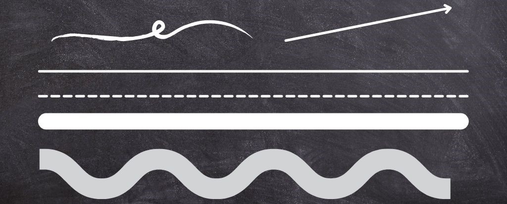
The line is a powerful element that can form a dominant emotion in the observer. Lines can be straight or curved, thin or thick, continuous or broken, vertical/diagonal/horizontal.
Lines define edges and space, create a sense of weight and volume, etc.

Color
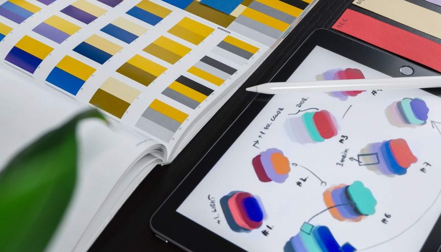
Color stimulates both mental and physical responses in the viewer. There are some responses associated with warm colors (red, yellow, and orange) and cool colors (blue, purple, and green). In general, warm colors are associated with active and exciting emotions while cool colors usually create passive and calming responses.
Color has 3 different properties: hue, saturation (chroma), and value (lightness or darkness).
Hue describes the wavelength of the color. There are colors classed as “pure hues”: red, orange, yellow, green, blue, and violet.
When you add saturation and value to a pure hue, you will create new tints, tones, and shades of a color.

Shape
A shape is enclosed two-dimensional space. The basic profile of a shape can consist of straight lines, curved lines, or a combination of both.
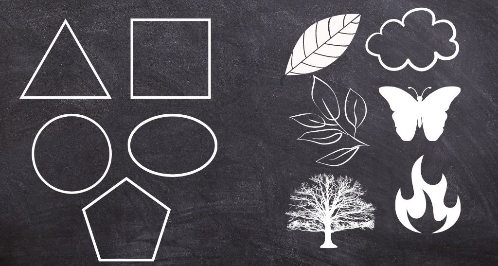
There are 2 general categories for shapes: Geometric and Free-Form shapes.
Geometric shapes are regular and can be described in mathematical terms. Some of the examples are triangles, squares, circles, ellipses, pentagons, etc.
Free-Form shapes are more difficult to define because they are irregular and uneven. Some examples of Free-Form shapes are clouds, butterflies, leaves, trees, rocks, fire…

Texture
Texture refers to the feeling or looks of the surface (how the surface feels or the way it is perceived to feel).
Tactile texture is a texture that you can feel by touch. Designers in 2D design use the second type – Visual texture. Visual texture is made on a flat surface and it’s basically the illusion of tactile texture.
The texture of an object can feel or look rough, smooth, soft, hard, silky, shiny, pebbly, and so on.
Space
Space is the area around, above, below, or behind an object. In the 2D design, space is about creating the illusion of a third dimension. For example, in a two-dimensional setting space can be created by shadows, sizes, overlapping, or color different from the background.
Example: You can use size to create the illusion of larger objects appearing closer and smaller seem to be more distant.
Principles of 2D Design
The principles of a good 2D design are guiding designers through a design process. The aim is to create effective and aesthetically pleasing outcomes.
These principles relate to the use of elements (line, color, shape, texture, and space).
The principles of 2D design are:
- Unity – providing a sense of cohesiveness
- Balance – balance can be symmetrical (2 halves of composition seem identical) or asymmetrical
- Rhythm/repetition – repeating of the visual elements
- Harmony – combining similar or related elements
- Emphasis – determining the most important visual center
- Contrast – comparing one extreme to another
- Proportion – one shape in relation to the size of another shape
Conclusion
To sum up, the elements of 2D design are essential for creating compelling visual content. Understanding how to effectively utilize the principles of line, shape, color, texture, and space can help designers to craft stunning compositions that effectively convey their intended message.
Whether you’re designing for print or digital media, mastering these fundamentals will help you to elevate your work to the next level. By experimenting with different combinations of these elements, you can create unique and eye-catching designs that stand out from the crowd.
By utilizing the tips and techniques outlined in this blog post, you can enhance your skills as a 2D designer and create visually engaging content that resonates with your audience.
In addition to exploring the elements of 2D design, it’s also important to stay up-to-date with the latest graphic design trends.
To further enhance your skills and stay ahead of the curve, we recommend checking out this informative blog post on Web25’s website, which outlines Nine graphic design trends: Stay Ahead of the Curve: 9 Graphic Design Trends to Elevate Your Work. By combining these insights with the fundamentals of 2D design, you can create stunning and impactful visual content that resonates with your audience.
Thank you for reading 🙂


This was really informative.